- The Noiseless Trader's Newsletter
- Posts
- Trendlines: More objective on Point and Figure? 🤔🤔
Trendlines: More objective on Point and Figure? 🤔🤔
P&F Trendlines v/s OHLC Trendlines.
Kaushik Akiwatkar
August 09, 2025


If someone forwarded this, join 1000+ others to get actionable trading & investing strategies in your mailbox every other weekday.
In our previous newsletter, we understood how to draw trendlines on OHLC charts. We understood a method that could make drawing trendlines more objective and easier than the traditional method. But no matter the method used, subjectivity still exists in drawing trendlines on OHLC charts. Today, let us understand how Point and Figure charts can help us plot trendlines with more objectivity than OHLC charts.
The concept of 45 degrees
On OHLC charts, trendlines are typically drawn by connecting important demand and supply points. But how are these points defined in a structured manner? One approach, as discussed in the previous newsletter, is to use market structure lows (MSLs) to mark demand points and market structure highs (MSHs) to identify supply points. However, since multiple MSLs and MSHs can form over time, a common challenge is determining which specific MSH or MSL should be selected to draw meaningful and reliable trendlines.
Point and Figure charts offer a structured way to assess market direction by removing noise and relying on objective plotting rules. A key feature is the use of 45-degree trendlines, a convention rooted in the days when traders manually charted on graph paper. These trendlines divide price movement into two clear zones—above the line suggests bullish strength, while below it indicates bearish pressure—making it easier to interpret trends with consistency and clarity.
Below are two charts of ASAHIINDIA. One is a an OHLC chart on Weekly Timeframe and the other is a Point and Figure chart on 1% (Daily) Timeframe. First observe the OHLC chart. The price formed a bottom in June 2020. A bullish trendline is drawn from this bottom, which was broken in January 2023 but the price recovered again. This would have led to a readjustment to the new trendline (dotted line).
Now observe the Point and Figure chart. The 45 degree trendline is drawn from the same bottom. Observe that we did not have to readjust this trendline multiple times. The trendline split the chart into two equal halves unlike OHLC chart, where it would have exited at the breach of the first trendline.
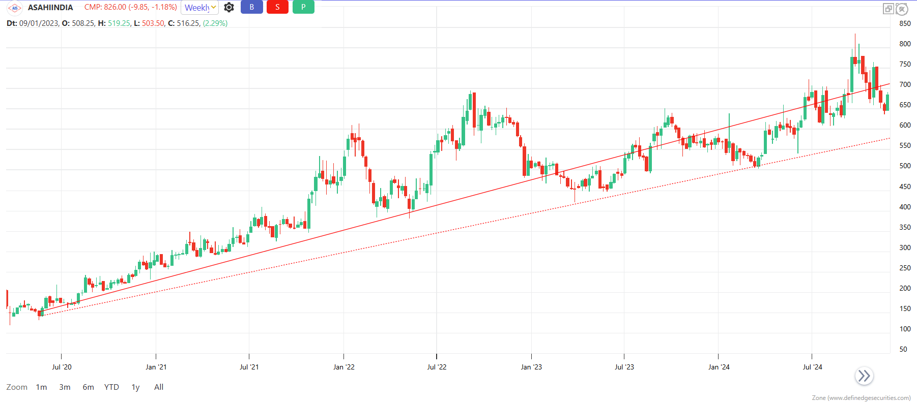
ASAHIINDIA (Weekly) TF

ASAHIINDIA 1% (Daily) TF
The reason why Point and Figure chart’s trendlines are advantageous can be seen in this example of CENTURYPLY. In the OHLC chart, the trendline is drawn from the low of June 2020. The trendline was breached In November 2022. Upon breach, this would have meant a bearish trend. However, the price recovered again and we had to re-adjust the trendline.
But in the Point and Figure chart, the trendline drawn from the same low continued to show a bullish trend.


CENTURYPLY (Weekly TF)

CENTURYPLY 1% (Daily) TF
Drawing trendlines on OHLC charts often leads to inconsistency and frequent adjustments, making trend analysis subjective and unclear. Point and Figure charts address this issue through their consistent 45-degree trendlines when plotted from key price levels. If you are looking to master such tools and apply them within a complete trading framework, the TNT One membership offers exactly that. With access to in-depth video modules, weekly live sessions with Prof. Kaushik Akiwatkar, and practical insights on topics like Point and Figure charts, Relative Strength, and risk management, TNT One helps you develop as an all-round trader.
Do check out TNT One. 👇👇👇
